The First Three Colors You Notice in This Visual Test: What They Actually Say About How People Perceive You
A viral color test claims the first three colors you see reveal how intimidating you are. Here’s the psychology behind it—and what actually shapes first impressions.
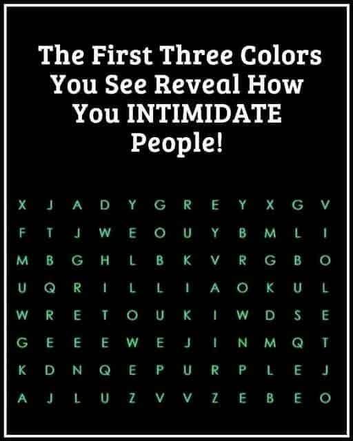
You’ve probably seen this before…
A post pops up on social media:
“The first three colors you see reveal how intimidating you are.”
It usually comes with a colorful image, bold claims, and comments like:
- “Mine were red, black, and gray… what does that mean??”
- “I saw blue first—am I approachable or weak?”
- “This is scarily accurate!”
It feels personal. It feels revealing. And it makes you pause.
But here’s the truth most of these viral “color personality tests” don’t tell you:
Your brain isn’t revealing your intimidation level—it’s revealing how perception, attention, and memory actually work.
Let’s break it down in a way that makes sense without the hype.
What This Viral “Color Test” Is Really Based On
These tests usually rely on a simple idea:
The colors your brain notices first are connected to personality traits like dominance, confidence, or intimidation.
It sounds scientific—but it’s not a validated psychological tool.
Instead, it’s loosely inspired by real concepts from:
- Cognitive psychology
- Visual attention research
- Color perception theory
- First impression formation
The problem?
Social media turns complex psychology into oversimplified personality labels.
The Real Science: Why You Notice Certain Colors First
Your brain doesn’t scan images randomly.
It prioritizes based on:
1. Contrast and Brightness
High-contrast colors grab attention first.
- Bright red pops quickly
- Deep black creates strong contrast
- Neon colors dominate visual space
So what you “see first” is often just what stands out visually—not emotionally.
2. Emotional Conditioning
Your experiences shape color reactions.
For example:
- Red → danger, urgency, passion
- Blue → calm, trust
- Black → authority, seriousness
But these associations are learned—not universal truths about personality.
3. Attention Bias
Your brain filters information constantly.
It asks:
“What looks most important right now?”
Not:
“What reveals my personality?”
4. Pattern Recognition Speed
Some brains process patterns faster than others.
That means:
- You may notice shapes before colors
- Or bold blocks before subtle tones
This is neurological efficiency—not identity revelation.
So… Do Colors Reveal How Intimidating You Are?
Short answer: No.
But here’s where it gets interesting.
While colors don’t define your intimidation level, they do influence how others perceive you in real life.
That’s where psychology actually comes in.
How People Really Decide If You’re “Intimidating”
In real-world psychology, intimidation is linked to perception of:
- Power
- Confidence
- Emotional control
- Social dominance
And these are influenced by:
1. Body language
- Strong posture
- Steady eye contact
- Controlled movement
2. Tone of voice
- Lower pitch is often perceived as more authoritative
- Calm pacing signals control
3. Clothing and visual presentation
This is where color does matter—but indirectly.
The Psychology of Colors in First Impressions
Color psychology is real—but subtle.
Here’s how colors are generally perceived in Western (including U.S.) contexts:
| Color | Common Perception |
|---|---|
| Black | Authority, power, seriousness |
| Red | Confidence, urgency, dominance |
| Blue | Trust, calmness, reliability |
| Gray | Neutrality, professionalism |
| White | Simplicity, openness |
| Green | Balance, stability |
But here’s the key:
These are social associations, not personality indicators.
Why Some People Seem More Intimidating
Let’s connect this back to the viral idea.
When someone appears intimidating, it’s usually because of:
- High confidence signals
- Minimal emotional expression
- Strong visual contrast (dark clothing, bold posture)
- Social context (authority roles, uniforms, leadership positions)
So if a color test shows “dark colors = intimidating personality,” it’s not revealing inner truth.
It’s reflecting cultural associations with authority and dominance.
The “First Three Colors You See” Effect Explained
This type of test relies on something called:
Selective attention illusion
Your brain:
- Notices a few dominant elements
- Ignores background noise
- Creates meaning after the fact
So if you see:
- Black
- Red
- Gray
Your brain may later think:
“That must mean I’m intense or intimidating.”
But in reality:
- Those were simply the most visually dominant colors in the image
Why These Tests Feel So Accurate
This is the part people don’t expect.
They feel accurate because of:
The Barnum Effect
People tend to accept vague statements as personally meaningful.
Example:
“You are strong but sometimes misunderstood.”
Almost everyone relates to that in some way.
Confirmation Bias
You remember the parts that “fit” you and ignore what doesn’t.
Self-Reflection Loop
These tests trigger introspection:
- “Am I intimidating?”
- “Do people see me as strong?”
That emotional engagement makes the result feel true.
Mini Reality Check: What It Does NOT Mean
Seeing certain colors first does NOT mean:
- You intimidate people
- You are dominant or submissive
- You have a fixed personality trait
- Others perceive you in a specific way
It is not a psychological diagnosis or personality classification.
What Actually Shapes “Intimidation” in Real Life
Let’s replace myth with reality.
Scenario 1: Workplace
A manager walks into a room:
- Neutral expression
- Confident posture
- Minimal small talk
They may be perceived as intimidating—even if kind.
Scenario 2: Social Setting
Someone wearing:
- Black blazer
- Calm expression
- Direct communication style
May appear more powerful or serious.
Scenario 3: Casual Environment
A friendly, expressive person in bright colors:
- Smiling
- Open body language
Will feel approachable, not intimidating.
So Where Do Colors Really Fit In?
Colors contribute to first impressions, not identity.
Think of them as:
“Emotional background signals,” not personality definitions.
Expert Insight (What Psychologists Actually Agree On)
Research in visual cognition suggests:
- Humans process visual hierarchy in milliseconds
- Color contrast affects attention more than meaning
- Personality cannot be inferred from color perception tests
- Context matters more than isolated traits
In short:
Your brain is fast—not symbolic.
Common Mistakes People Make With These Tests
Mistake 1: Treating entertainment as psychology
These are designed for engagement, not diagnosis.
Mistake 2: Over-identifying with results
A momentary impression ≠ personality trait.
Mistake 3: Ignoring context
The same color means different things in different settings.
Mistake 4: Assuming universality
Color meaning varies across cultures.
A More Accurate Way to Think About It
Instead of asking:
“What do the colors I saw say about me?”
A better question is:
“Why did my brain notice these visual elements first?”
That leads to real self-awareness about:
- Attention patterns
- Emotional sensitivity
- Visual processing style
Practical Takeaway
If you enjoy these tests, treat them like:
- Personality quizzes
- Optical illusions
- Social media entertainment
Not psychological evaluations.
Frequently Asked Questions
1. Do the first colors I see really mean anything?
They reflect visual attention, not personality traits.
2. Can colors reveal if I’m intimidating?
No scientific evidence supports that.
3. Why do people get different results from the same image?
Differences in attention, eyesight, lighting, and perception.
4. Is color psychology real?
Yes—but it relates to general emotional associations, not personal identity.
5. Why do I always notice dark colors first?
Likely due to contrast sensitivity and visual focus patterns.
6. Are these tests used by psychologists?
No, they are not clinical tools.
7. Why do these results feel accurate?
Because of cognitive biases like the Barnum effect.
8. Can I change how people perceive me using color?
Yes, in fashion and branding—but it’s subtle and contextual.
9. Do cultures see colors differently?
Absolutely—color meanings vary widely across societies.
10. Should I take these tests seriously?
No—treat them as entertainment, not analysis.
Action Checklist
- ✔ Understand this is a visual attention phenomenon
- ✔ Avoid over-interpreting social media personality tests
- ✔ Focus on real behavioral signals of perception
- ✔ Use color awareness for style, not identity labeling
- ✔ Remember context matters more than any single visual cue
The Bottom Line
The first colors you notice in a viral image don’t reveal how intimidating you are.
They reveal how your brain processes visual information in milliseconds.
Intimidation, on the other hand, is shaped by behavior, presence, and context—not a color pattern in a social media graphic.
It’s easy to see why these posts go viral—they’re fast, personal, and emotionally engaging.
But real psychology is more nuanced, and honestly more interesting.
Because instead of reducing people to color choices, it shows something better:
Human perception is complex, adaptive, and far more intelligent than online quizzes give it credit for.
If this helped you rethink one of those viral “tests,” share it with someone who’s taken one recently—you’ll probably start a good conversation.
And if you’ve ever been surprised by your result, you’re not alone. Most people are.